Thursday, October 30, 2008

Lots of Exciting News

HELLO everyone, where do I start?

Anyone who knows me knows just how much I LOVE the stamps from Flourishes and My Favorite Things.
Well guess what?? They are now available in Australia. In less than 24 hours (1st November 9am) the site will be launched. It is called Heavenscent Crafts. Now Debbie who owns the store is such a doll, she is also stocking lots of other unique stamps not found anywhere else in Australia, companies like High Hopes Stamps, Magnolia Stamps, Stampavie just to name a few.
The other great news is that Debbie has asked me to join her new design team. So you will see my cards on the website plus on the display boards at craft shows and in her Melbourne store.

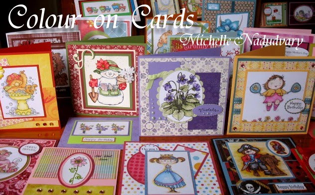
Here are a couple of my cards that you will see in the gallery.
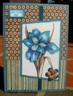
*The Siberian Iris card is from Flourishes, Designer Paper in this card is from KaiserCraft
**The Bath card is from My Favorite Things (MFT) Designer paper is Basic Grey "Euphoria"
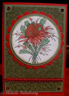
***The Get well card is also MFT. Designer paper is CollagePress Doubletakes.

All images are stamped on to whisper white from SU, All plain cardstock is Bazzill.
All images are coloured using Prismacolor Pencils.
Michelle's Hint #2
Re-Ink your inkpads regularly, Most of my cards are stamped with Black Brilliance. I will re ink my pad approx every 2 weeks to keep the colour topped up and 'lush'. If I am making lots of cards sometimes I do it each week. There is nothing worse than an image that is 'wishy washy'. It really lowers the quality of your card.

Until Next time
Inking of you all
Michelle

Tuesday, October 28, 2008

Flourishes Featured Stamper #22


I was fortunate enough to be named Flourishes Stamper of the week last week. I shared the honour with a wonderful lady called Lois (aka Clownmom on SCS) for more information and to see Lois's card checkout Flourishes Newsletter.


My card was the one I featured on my 18th October post called 'All in the details'. Here is another photo just to refresh your memory
The stamps on my card are from the Flourishes set called "Summer on the Patio". This is such a great set, so versatile.I just love it. Keep reading down the page for the Original post.


Until Next Time
Inking of you All
Michelle

Saturday, October 25, 2008

Adapt a stamp... part 2

Going back a few weeks, I did adapt a Stamp...Part 1. My local stamp group did a series of flower images and we all created very different cards. Here is another image for you to look at. This is an Australian Native flower called the Waratah, the stamp itself is from Stamp World.

This card is my effort in the challenge. I chose to do mine in a circle I cut the circles using nestabilitites Classic circles. The green cardstock is mellow moss, the red was bazzill, I am unsure where the designer paper came from, one of those pieces I've had put away for years.
Once again I chose to colour with my Prismacolor pencils, I just love the effect I get with them.You can almost achieve a 3D look just from your colouring.

Until next time
Inking of you all
Michelle

Friday, October 24, 2008

Believe in Beauty

Yet another new image that I have just fallen in love with. The bird and the sentiment are from an unmounted RUBBER set by Pink Poison Stamps.
I started off by stamping the bird in Black stazon, on SU naturals Ivory cardstock (CS). I then coloured it using Prismacolor pencils and blended with Odourless Mineral Spirits (OMS)or Gamsol. I cut around the tail with scissors and carefully cut with the classic oval nestabilities. NOTE: Pull tail outside of oval nesties frame so it doesn't get cut off.
Cut another oval out of Stampin UP (SU) River Rock CS and a scalloped oval from SU Cranberry Crisp. Layer together as shown.
The sentiment is stamped in SU Cranberry Crisp Ink on River Rock CS.
The designer paper is from We R Memories and co ordinates beautifully with these colours.
Michelle's Hint: #1
Choose your Patterned Papers and matching coloured cardstock first . Then colour your image to match. This way your project will be much better co- ordinated.
Too many people colour first than try to match papers and cardstock, this really is the hard way to do it. Nobody likes doing things the hard way.
Until Next Time
Inking of you all
Michelle

Saturday, October 18, 2008

It's all in the details

Summer Fruits. This is the card I made for this weeks Flourishes Tuesday Chat Challenge on the Splitcoast forum. The Challenge this week was to make a card with a non- traditional fold. I still had the traditional fold in there but I added an an extra fold on the card front.
The fold is not so obvious front on so here is another angle for you to see it a little better.
The stamps are all from Flourishes
I have stamped the image (using the basic masking technique on the fruit and table see below) on whisper white cardstock and coloured with Prismacolor Pencils , I have blended the pencils using odourless mineral spirits.
The purple and green cardstock are all Bazzill and the designer papers are from the new Basic Grey pad "Eva".

In this 3rd photo you can see how I have mounted the sentiment in 3 layers. I have used the Nestabilities Petite Ovals. Top layer is the sentiment in contrasting green. The 2nd layer has a very small scalloped border. I have kept it the same colour as the 3rd layer, just to provide the card with a bit of detail without standing out to much.
The last of the small details is the dimensional magic on the fruit. This photo shows the masking at it's best. I stamped the bowl of fruit first, then the table. Without the use of masking the bowl of fruit would have the line of the table through it. You can also see the pencil shading I have used to give a flat stamped image more of a 3D appearance.

Until Next Time

Inking of you all

Michelle


Monday, October 13, 2008

Opulent Orchids and 15% discount

Aren't these Cooktown Orchids by Amazing Creations just beautiful? I love this stamp, It is amazing how different the one stamp looks just by changing the colours and the papers. This first card is coloured in shades of pink and mauve. I have layered the card using the new papers from Basic Grey called Eva. The plain coloured cardstock is all Bazzil, I have used 'Velvet', 'Heidi' and 'Pickle'. I have coloured in using my favourite medium, Prismacolor Pencils.
This second card is coloured in shades of pink and I have layered it using Amazing Creations own range of papers, They can be found here. I don't know if you'll agree but I think what really sets off this card is the black cardstock . I think it accents the hot pink very nicely. I would love to hear what you think. Dont forget Amazing Creations will give a 15% discount to anyone who mentions my blog.With the $US and $AUS exchange rate at the moment that means USA readers will get a very good deal indeed.


Until Next time
Inking of you all
Michelle

Thursday, October 9, 2008

World Card Making Day/ Weekend

Saturday 4th October was world card making day. myself and some wonderful friends had a great weekend with 4days/ nights of making cards, calendars. etc. Lots and lots of stamping and colouring was going on. I was very proud of my effort I completed 20 cards and did the makings for another 5.
Here are some of my cards for you to see. All are coloured with Prismacolor Pencils.

This 1st one is made using the Siberian Iris from Flourishes. The Layout was designed by Faith Hofrichter for the Flourishes Tuesday Chat Challenge on Splitcoast Stampers. Such a simple layout, but looks terrific .

Next is these gorgeous Penguins. These are 2 separate stamps but I just love to use them together. The matching Designer paper was a gift from a wonderful friend for my birthday.
Last card for today is another Flourishes stamp from their Coffee with Friends set. The designer paper is from Flair and co ordinated with Choc Chip from SU.
I will feature more cards over the next few days.
Until next time
Inking of you all
Michelle